IN THE STUDIO

dans l’atelier

What it is—

Component #1: the newsletter

Think of it as your invitation to coffee. It’s where we talk about what really happens in the studio—the inspiration, the difficulties, and the joys. I want to peel back the curtain on this very full life as a florist, creative, entrepreneur, and mother with young children. In doing so, I hope to entertain your curiosities and encourage you through your struggles and towards your own dreams.

Component #2: this! the blog

This space acts as a folder for things I mention in the emailed newsletters. My goal is to keep the newsletter short and sweet. You can simply read the letter and be done, or delve deeper into a topic by clicking a link to a longer article or a more thorough gallery of images. This is where those additional musings and images will live.

Enter the atelier

Enter your name and email below for a regular peek into the studio or continue scrolling to view the latest news and musings BUT only the emails give you the whole picture.

Wedding, Special Project Emily Phillips Wedding, Special Project Emily Phillips

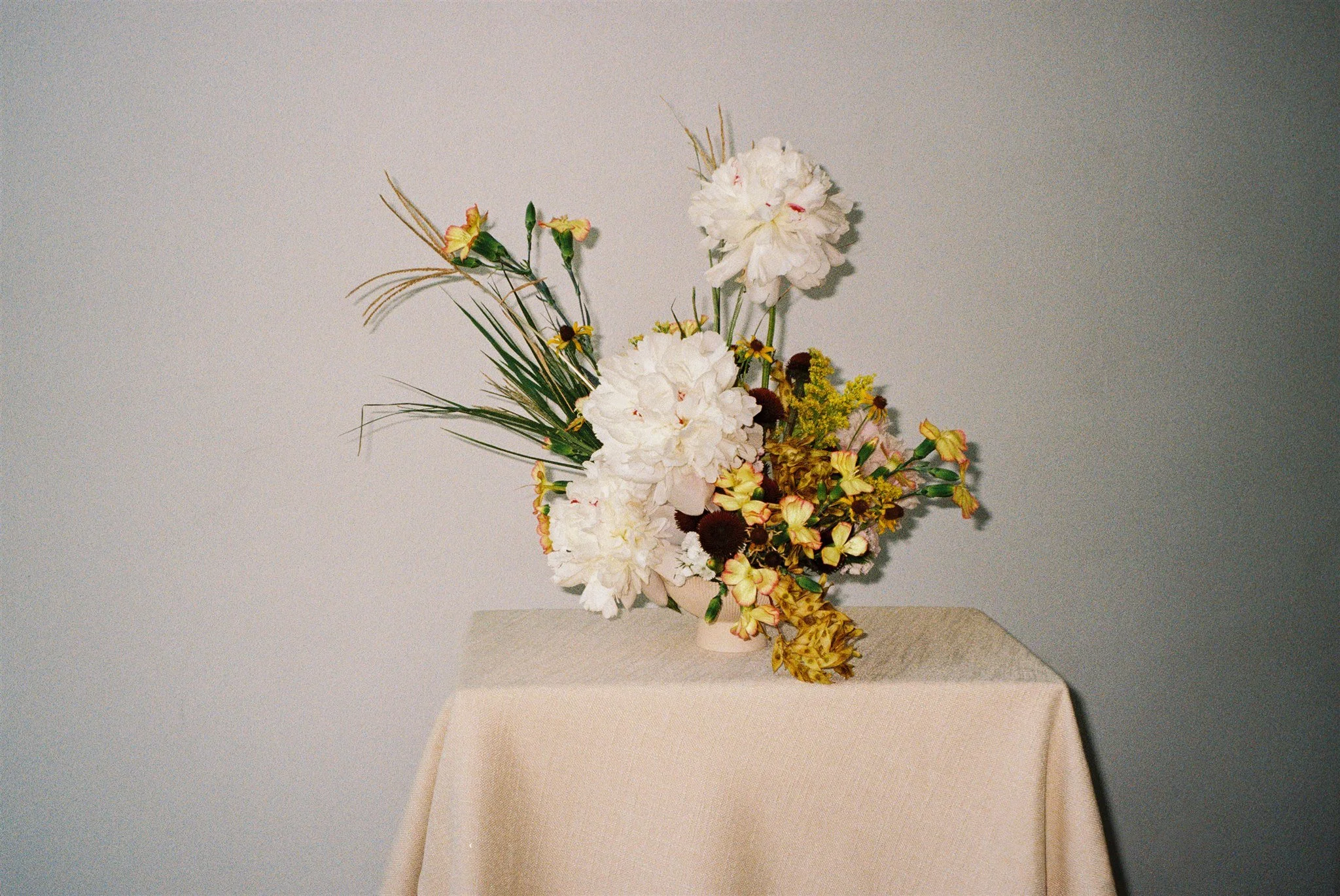
Color palette for a late summer wedding in Alabama

I think some people assume that color means bold when in reality, using color is another way to share your story and adds a new level of sophistication.

A colorful wedding does not mean all of the details are filled with highly saturated pigments. Having a tastefully colorful wedding palette comes from a designer's understanding of color. It means that your color palette has just the right tint or shade of each hue. Often times, a dark shade of green or blue is as versatile and basic as black. Using a color instead of black creates a more interesting visual story. Pure black and pure white are actually quite strong and bland. Having tints or shades of other colors creates a softer, more unified look for the event overall. I think some people assume that color means bold when in reality, using color is another way to share your story and adds a new level of sophistication.

Below is an example of a colorful wedding palette that still reads soft and romantic.

Planned and designed by Lauren Field; Photographed by Shauna and Jordon Photography; Venue Stonewood Farms; Floral Design by Emily Kaye Floral; HMU by Canvas and Coif; Videography by Megan Pettus Films; Rentals from Prophouse, Tablemade, Nuage; Cake by Cakes by Kim; Stationary by A Good Day Inc; Silk Ribbon by Tinted Studio; Fashion by Ivory and White Boutique, Monique Lhuillier, Oscar de la Renta, Mr Burch Formal

Read More

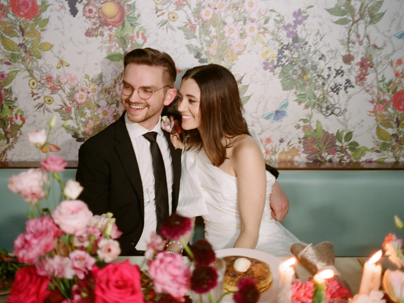
Chic breakfast themed afterparty

One of my regrets from my own wedding is not letting the party go longer. Likewise, one of the weddings I most enjoyed attending was one where we stayed until the early hours of the morning and breakfast tacos were served around 1:00AM
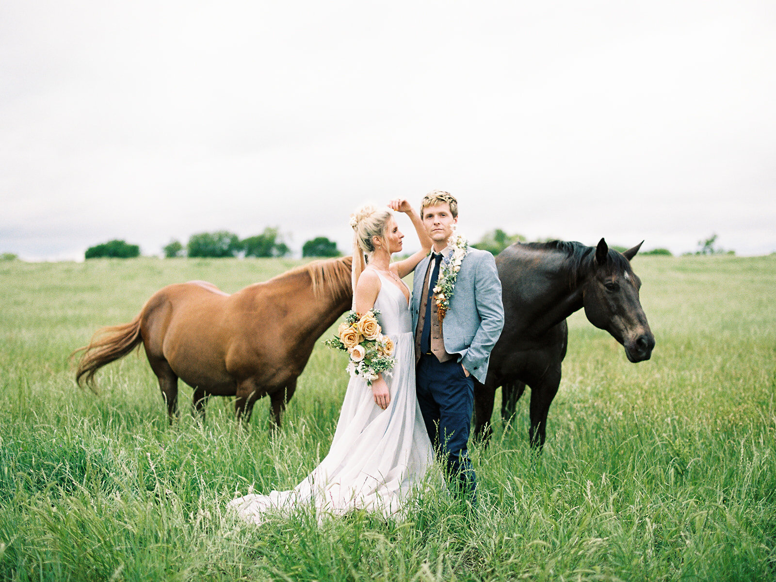
One of my regrets from my own wedding is not letting the party go longer. Likewise, one of the weddings I most enjoyed attending was one where we danced until the early hours of the morning. Breakfast tacos were served around 1:00AM for those of us who didn't want the night to end.

Whatever kind of timeline or ending you choose for your own wedding, do it because it's a true reflection of what you love and of who you are. The timeline options for your wedding weekend are endless. Do you want your older relatives to be able to send you off? But you don't want to say farewell yet to your younger friends? Then perhaps you should consider an afterparty to keep the fun going or a brunch the next morning.

This inspirational post for an extravagant after party is full of colorful red florals, maximalist style, and gourmet pancakes in a chic downtown diner. Consider subbing the cocktails for mimosas and make this your morning after breakfast for your destination wedding.

https://vimeo.com/786064825

Florals and design by Emily Kaye Floral Atelier; Photography by Abigail Lewis Photo; HMU by Margaret Snider Co; Linens from White Table Specialty Linen; Tabletop from Luma Designs; Location The Dwell Hotel; Dress by Helen O'Connor; Video by Brittany Sturdivant

Read More
Special Project Special Project

Color of the Year 2021

Some artists could care less about Pantone's Color of the Year 2021. Granted, what Pantone chooses each year does not have any direct affect on what I design for my clients. What I love about this arbitrary decision though is the conversation it creates and the platform it becomes for creativity. That is especially true this year.

This year, for the first time, Pantone chose two colors: Illuminating (13-0647) and Ultimate Gray (17-5104). This color choice aroused a lot of criticism from my designer friends in the wedding industry. Grey and yellow? So 2010. Grey is no longer on trend and yellow can be garish, especially as a primary color in a palette. So why did Pantone choose grey and yellow for the 2021 color of the year? They call it, "a marriage of color conveying a message of strength and hopefulness that is both enduring and uplifting." The yellow is like the light at the end of a dark, grey tunnel. We shall call this tunnel the year of 2020.

Although Pantone's choice received disapproval from many, these difficult to reconcile colors create a wonderful design challenge for an artist like myself. In order to peacefully unite these colors, the full color story of the design becomes extremely important. I love a design challenge. It's when we become truly creative. This year, Pantone pitched a curve but I think we knocked it out of the park through our interpretation below. Never be afraid to experiment and to test your limits.

Pantone inspired studio shoot with Emily Kaye Floral

To view work inspired by Pantone's 2018 color of the year, Living Coral, enjoy this unique use of peonies.

This project was styled by Emily Kaye Floral Atelier, photographed by Abigail Lewis Photography, modeled by Anne Marie at W Road Collection, with dress and accessories from Anthropologie.

Read More